Prosper Brand Guide & Component Library
Prosper was founded in 2005 as the first peer-to-peer lending marketplace in the United States. Since then, Prosper has facilitated more than $23 billion in loans to more than 1,400,000 people. Through Prosper, people can invest in each other in a way that is financially and socially rewarding. Borrowers apply online for a fixed-rate, fixed-term loan between $2,000 and $50,000. Individuals and institutions can invest in the loans and earn attractive returns.
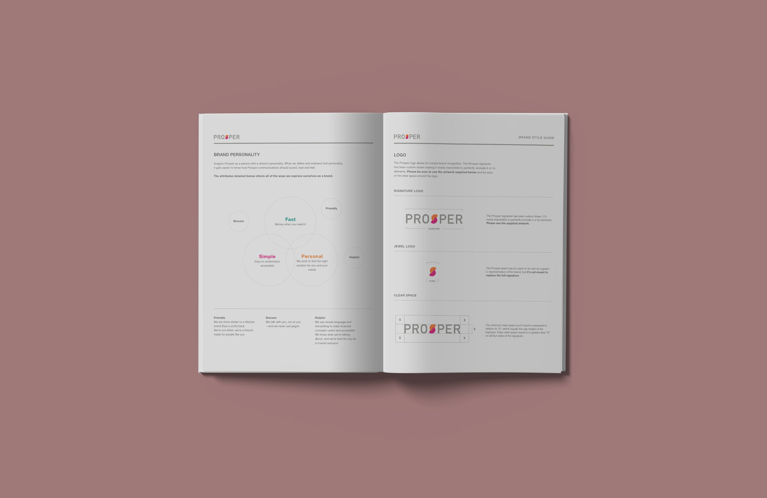
Our goal was to establish a brand guide and Figma component library to be used across the company and to share with our third-party partners.
My role
I collaborated with fellow designers, UX writers, and a marketing manager to develop the Prosper brand guidelines, living brand guide, and Figma component library.
Developed a living style guide that was shared with marketing partners.
Designed and tweaked visual elements to ensure consistency with the brand.
Contributed to the componentization of the Figma library, which is now being used across the company.


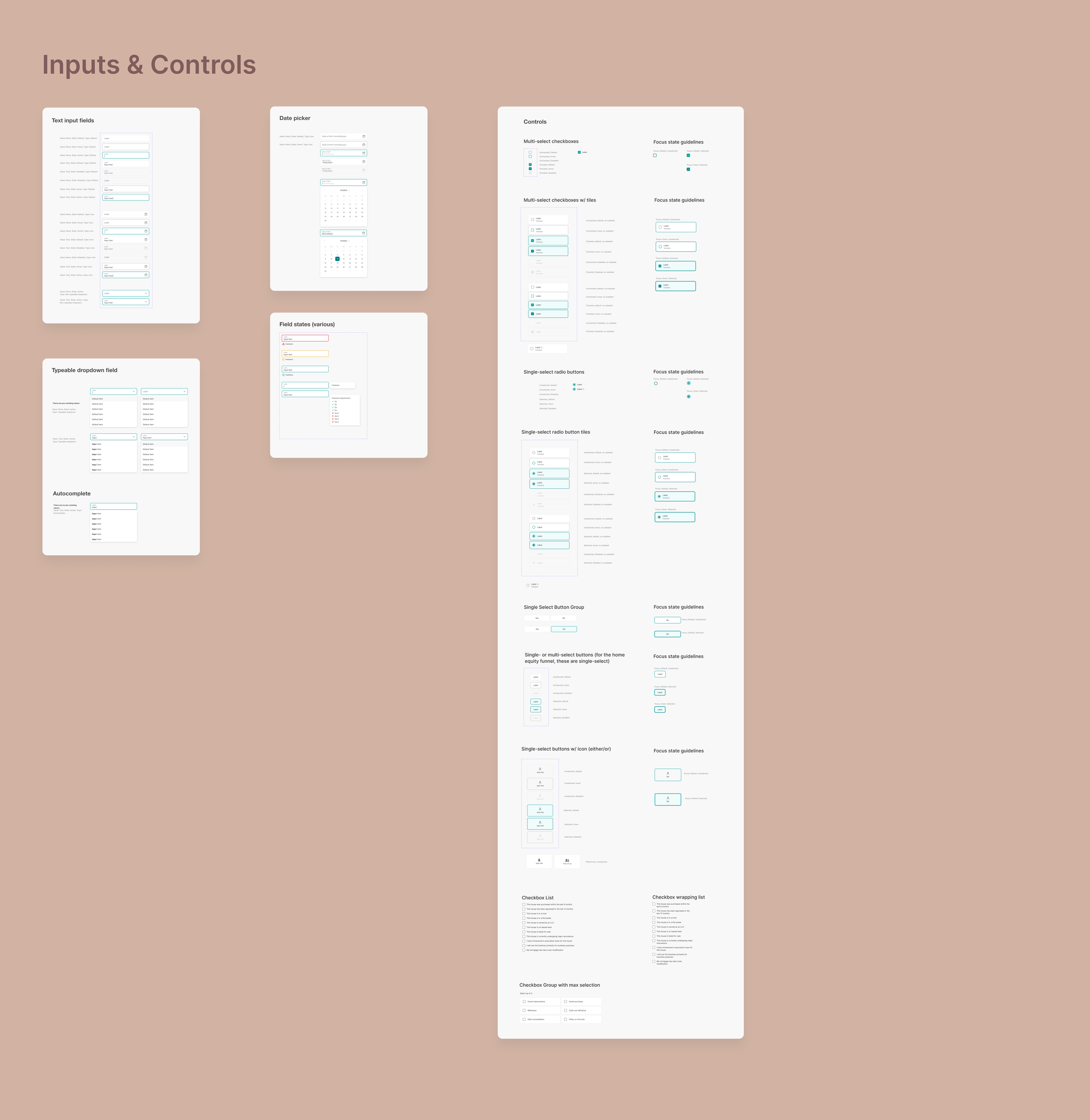
Component Library
The Figma component library streamlines the workflow for our design team and developers. It allows them to reuse UI elements and attributes, ensuring consistent and scalable designs. When there's a need to adjust something, like the brand's link color or home icon, a single change in the primary component or style ensures the update is reflected throughout the design.


